Introduction
This is the final project for the Applied Data Analysis course, EPFL.
What?
In this project we plan to explore the differences in the representation of different genders in quotations from news websites, from January 2015 to April 2020, using data from Quotebank. We will explore the following genders: male, female, transgender male, transgender female, non-binary and genderfluid, but mostly focus on men and women.
Why?
“Gender equality is the goal that will help abolish poverty that will create more equal economies, fairer societies and happier men, women and children”
–Graça Machel (former First Lady of South Africa)
Gender equality is a long-fought battle, one that has already taken long strides in the past centuries, be it in representation in the workplace, wage gaps, or legislation. But has it been enough? And specifically in online journalism, are all genders given a fair shake when quoted in articles?
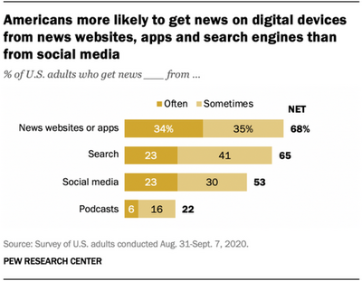
According to this study conducted in 2020, 34% of North Americans often get their news from news websites.
This is a huge audience, and by being able to choose what speakers they quote, and what quotes they select, journalists hold a power that many may underestimate, and can influence millions of opinions. With great power comes great responsibility1, and we plan to investigate how this power is being used to represent different genders.
How?
The dataset from Quotebank consisted of a list of around 100 million quotes featured in news articles in English, from January 2015 to April 2020. It included information such as the most probable speakers for each quote, the number of total quote occurrences (how many times a quote appeared in articles), and the date of the first occurrence. Using data from Wikidata, we were able to get the gender of each speaker.
Initial Analysis
Not your usual 80-20 rule
Just to see how things are generally doing, we’ll plot the percentage of quote occurrences by gender (the total number of times speakers of different genders were quoted) and the percentage of speakers by gender. On the plots below, the genders other than male or female are essencially not visible. If you wish to see their evolution over time, simply deselect the male and female lines from the legend on the right.
From this plot, we see that men get quoted around 80% of the time. This percentage is about 4x bigger than the one for women. Yikes. However, not everything is lost, as we do see a slightly decreasing trend in male quotations, with 84% in 2015 and 81% in 2020. We also see an increase of about 3% in quotes from women.
All the other genders are massively underrepresented in news articles, most of them resting below 0.1% of quotations. We also don’t see any increasing tendencies, only distinct peaks. For example, Caitlyn Jenner came out as a transgender woman in April 2015, so there are peaks in the transgender female plot at that time. Another example, Miley Cyrus revealed she is genderfluid in June 2015, so we also observe peaks there.
Now you might be thinking: “Of course men get quoted way more often, they have very influential people like Donald Trump and Barack Obama”. Well, yes but actually no. If we look at the percentage of speakers by gender, it looks just about the same. Around 80% of quoted speakers are male, with a very slight decrease of 2% over the past 5 years. In genders other than male and female, transgender female speakers dominate at around 0.08%.
Trump, Trump, and more Trump
Above are the top speakers of every month by gender and, to no one’s surprise, Trump is the most quoted speaker of the last 5 years. Since the beginning of 2016, when the presidential race started going strong, the former President of the USA has consistently been the most quoted speaker almost every month. In the months when he is the top speaker, Trump averages around 117,000 monthly quote occurrences. That is more than 6 times the amount for the top speakers of all other genders combined.
First Impressions: Not great…
These initial numbers don’t look too promising. Men dominate in every plot we’ve seen, by a big margin. Now that we have a general idea of how (badly) things are going, let’s dive deeper and try to find exactly what each gender tends to talk about.
Topic Analysis
We’ve seen that not everybody is getting the same platform to speak from. But what exactly are speakers talking about? To look into that, let’s consider a few key topics, presented here in no particular order.
- Business
- Sports
- Government
- Climate Change
- LGBT
- Money
- Family
- Health
Business runs the world
Let’s start with the percentage of words from different genders that fall into these topics.
The main takeaways from here are:
Men tend to talk more about business and sports
Women tend towards business and government
The topics men and women talk the least about are LGBT and Climate Change
As far as the minority genders are concerned, they present a lot more fluctuations (partly due to the smaller sample size). Surprisingly, they follow the trends set by the men and women fairly well. In fact, their least significant topics are LGBT and Climate Change (except for some occasional spikes). This is, in a way, good news because it means that people from genders other than male and female aren’t getting cherry-picked to be used as tokens in certain topics. If that were the case we would expect, in particular, to see a signficant dominance of the LGBT topic, which is not the case. It is true: they are widely under-represented, but at least they are getting a say in about the same topics as everybody, in the same ratio.
Now, for the distributions of genders in each topic, see the plot below.
Well, this is worrying… Business has about 20x more words than Climate Change and 500x more words than LGBT. There isn’t a clear positive trend in the evolution of the number of words for LGBT and Climate Change, which is a sign that they are not having the exposure they require.
This shows that despite some claims that media is saturated with a “liberal agenda”, these issues are much less represented than any of the main “traditional” topics, like business, sports, and government.
Sentiment Analysis
Not everything in the world is about business though… On a more emotional note, we want to explore the sentiment present in these quotes: are they mainly positive, negative, or neutral?
For this analysis, we compare quotes by their sentiment scores, which can take values between -1 and 1 2. A sentiment score of 0 can be regarded as a neutral quote, while positive and negative scores represent positive and negative sentiment in quotes, respectively.
The sentiment scores for men and women lie between 0.15 and 0.26, which is close to neutral but still positive. However, male quotes tend to be more positive than female ones pretty consistently throughout the years.
On the other hand, quotes belonging to transgender-male, transgender-female, genderfluid and non-binary genders, which are aggregated in a single group named “others”, tend to have more oscillating average sentiment scores. Still, quotes from other genders tend to be more negative than for men and women, sometimes dipping into the negative scores. For these genders, we can observe both positive and negative average scores that cover a wider range from -0.15 to 0.32. This was to be expected since most of the times we hear, for example, transgender speakers in the news, they’re talking about problems like discrimination, bad healthcare, or unfair legislation.
Oh and if you are wondering what might be the cause of the negative spikes of other genders around 2016, here might be one of the causes: North Carolina governor signs controversial transgender bill.
Liberal vs Conservative
Focusing on males and females, we’ll see if the difference we have seen in sentiment scores persists when we divide news sources into two categories: liberal and conservative. We have created 2 lists that contain some of the most popular liberal and conservative news sources according to Aelieve Digital Marketing 3 and ThoughtCo 4 5.
- Liberal news sources: CNN, Huffington Post, The New York Times, Politico, Slate, ABC News, Daily Kos, The Washington Post, Time Magazine, The Atlantic.
- Conservative news sources: National Review, The American Spectator, The American Conservative, The New American, The Washington Times, FrontPage Magazine, The Washington Free Beacon, The Blaze, Cybercast News Service (CNS News), Human Events.
First, we make an overall comparison between liberal (denoted by L) and conservative (denoted by C) news sources, then take a deep dive into each website separately.
Here are some facts we take from this analysis:
In liberal news sources, women speak on average 16% more positively than men.
In conservative news sources, men speak on average 35% more positively than women.
Although this is not a good thing to see, it isn’t completely unexpected. To observe these differences a bit more clearly, observe the box plot below.
For all the statistics enthusiasts out there: don’t be worried. We performed a hypothesis test on the claims above and they are statistically significant with a confidence level of 95%.
News Source Deep Dive
Now that we had an overview of the sentiment score differences concerning gender and news source category, let’s have a closer look into the behavior of individual news sources.
Among liberal news sources, the New York Times is the most “sentimentally” even source, with a close gap between male and female sentiment, followed by Slate, The Atlantic, Politico, and CNN.
Huffington Post has the biggest liberal gap in sentiment scores, followed by Time Magazine. We can also note that 9 out of 10 of the representative liberal news sources have quotes with higher sentiment scores from females, only 1 has a reversed trend, which is The Washington Post.
Interestingly, for conservative websites, we see small gaps all around. However, the Washington Times presents the biggest sentiment gap, which is positive towards men. As for the smallest gaps, we have National Review first, followed by The American Conservative, The American Spectator, and The Blaze. By looking at the sizes of the data points in the graphs, in addition to the sentimental differences, we can see that conservative news sources make less use of quotations than liberal news sources.
Text Complexity
Another metric that can be used to spot bias is the text complexity6. Quotes are, by their very nature, unchangeable. However, the quotes chosen can be very representative of the point of view, or the bias, of a news source. One of the possible choices is the complexity (or difficulty) of the quotes used. Using very complex quotes might alienate the public from the speaker. On the other hand, a systematic usage of very simplistic quotes might give the illusion of trivial and basic speech. So a systematic usage of too difficult or too simple quotes can project the wrong impression of a group of people.
Here, we will focus mainly on the differences between men and women, as we didn’t find any significant trends on the minority genders. Moreover, we will split our sources into liberal and conservative, and see how they handle the text complexity.
On the plots below we show the differences in text complexity by men and women, for a series of conservative and liberal news sources. These results were obtained by averaging out the data from the all years available, and the error bars represent the standard deviation of the difference between the two complexities.
The bars show the difference of complexity between men and women, and hovering over the bars we may see the actual values for men and women. There is a conversion table that translates these numbers into an approximation of the school level needed to understand the text. We present it below for convenience.
| Score | Interpretation |
|---|---|
| 4.9 or lower | easily understood by an average 4th-grade student or lower |
| 5.0 - 5.9 | easily understood by an average 5th or 6th-grade student |
| 6.0 - 6.9 | easily understood by an average 7th or 8th-grade student |
| 7.0 - 7.9 | easily understood by an average 9th or 10th-grade student |
| 8.0 - 8.9 | easily understood by an average 11th or 12th-grade student |
| 9.0 or higher | easily understood by an average 13th to 15th-grade (college) student |
It appears that liberal websites are more prone to choose quotes of higher complexity for men than conservative ones. To compare the results we have summarised the key findings in the table below.
| Category | Metric | Value |
|---|---|---|
| Liberal | Mean Difference | +0.298 |
| Liberal | Mean Male Scores | 9.707 |
| Liberal | Mean Female Scores | 9.410 |
| Conservative | Mean Difference | +0.119 |
| Conservative | Mean Male Scores | 10.458 |
| Conservative | Mean Female Scores | 10.339 |
The results above would appear to present a slight leaning towards higher complexity for males, and a quick statistical test will prove that these results are statistically significant with a confidence level of 99%, both in the differences between gender and in the differences between news sources. That means we can say with high confidence that conservative news sources choose more complex quotes than liberal ones, and that both of them choose systematically more complex quotes for men than for women.
However, given that in general we have high levels of complexity for all the groups considered on the table above, it will not reflect in a very big change of public perception in that respect. Nevertheless, it is good to keep in mind that here we found yet another bias.
TL;DR
Here are some of the main takeaways from all the analyses performed:
About 80% of the time you see a quote in an article, it will be from a man. This percentage has been very slowly decreasing throughout the past 5 years.
About 80% of quoted speakers are male. Again, a very slight decrease has been happening, together with the increase of female speakers. No positive trend observed in transgender, genderfluid or non-binary speakers.
Men talk about business and sports, women about business and government. Other genders tend to talk more uniformly throughout topics. The least observed topics are Climate Change and LGBT all around.
Liberal websites tend to show more positive quotes from women, conservative websites do the opposite.
In general, men’s quotes are more complex than women’s quotes, and conservative news sources choose, on average, more complex quotes than liberal sources.
Final Words
The results showed in this article do not leave us with much hope for the state of gender representation in news websites. Journalists must start making some big changes to the way they handle quotes. They need to provide a bigger platform for women and speakers from minority genders. They need to talk more about some of the most pressing issues in modern society, like Climate Change and LGBT issues. They should try to close the gaps we’ve seen in the quotes’ sentiments and textual complexity.
News articles reach hundreds of millions of people, and a portion of them rely almost exclusively on these articles to shape their view of the world. Therefore, the gender biases present in these articles can propagate into the mindsets of the population and thus into their actions.
In conclusion, we should Mind the Gender Gap prevalent in news articles, so we can close these gaps in the minds of the writers and the readers (see what we did there?).
The team
-
Uncle Ben, 2002 ↩
-
For sentiment score calculation we used nltk’s sentiment intensity analyzer. ↩
-
Representative liberal news sources from: Top 20 Most Visited Liberal Websites ↩
-
Representative conservative news sources from: Top 9 Conservative News and Opinion Websites ↩
-
Representative conservative news sources from: The Top 10 Conservative Magazines ↩
-
There are several formulas to calculate text complexity. For our purposes, we used the Dale-Chall Readability Formula ↩